How to Build a Scalable Design System in 2026
A comprehensive guide on building scalable, accessible design systems in 2026, using design tokens, Tailwind CSS, Radix primitives, and efficient handoff workflows.
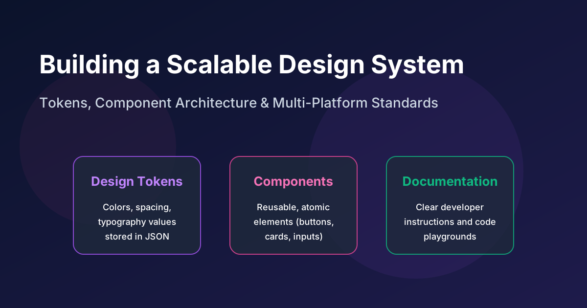
How to Build a Scalable Design System in 2026
As web applications grow, maintaining visual consistency, accessibility, and development speed across multiple teams becomes a major challenge. Without a unified UI framework, developers end up writing duplicate styles, custom layouts, and inconsistent interactive components.
A design system solves this problem by serving as the single source of truth for your brand's digital design standards. It combines design tokens, UI components, documentation, and development guidelines to ensure team alignment.
In this guide, we explain the key steps to build a scalable, accessible design system in 2026.
1. Establish the Foundation: Design Tokens
Design systems are built on design tokens—the smallest, indivisible visual values of your interface design (such as color hex codes, font sizes, line heights, border radius values, and spacing guides).
Instead of hardcoding colors (#3B82F6) or layout values directly in your CSS, you define them as variables.
The Tiered Token System
In 2026, modern design systems use a three-tiered token structure:
- Global (Reference) Tokens: The raw values of your brand assets (e.g.,
blue-500: #3B82F6,neutral-900: #111827). - Alias (Semantic) Tokens: Tokens that define meaning or context (e.g.,
background-primary,text-success,border-error). - Component-Specific Tokens: Tokens mapped to a single component (e.g.,
button-bg-hover,input-border-focus).
Using semantic tokens allows you to implement features like dark mode or brand rebranding easily by changing the values mapped to the alias tokens, without needing to rewrite component code.
2. Implement Components with Tailwind CSS and Radix Primitives
When coding components, developers face a choice: build everything from scratch or use an off-the-shelf UI framework.
Building from scratch requires significant time to implement accessibility and keyboard navigation. Using rigid component libraries can limit your design flexibility.
In 2026, the industry standard is to combine Tailwind CSS for styling with Radix UI Primitives for component functionality:
- Radix UI Primitives: Providing unstyled, highly accessible React primitives (like dialogs, dropdowns, accordions, and tabs) that handle keyboard navigation, ARIA attributes, and screen reader support out of the box.
- Tailwind CSS: Allowing developers to apply custom styles directly to these accessible primitives, giving teams full design control.
Example: Building an Accessible Popover
Here is a simplified example of building a popover component using Radix and Tailwind:
import * as Popover from '@radix-ui/react-popover';

export default function SmartPopover() {
  return (
    <Popover.Root>
      <Popover.Trigger className="px-4 py-2 bg-blue-600 text-white rounded-lg hover:bg-blue-700 transition-colors">
        Open Options
      </Popover.Trigger>

      <Popover.Portal>
        <Popover.Content className="w-64 p-4 rounded-xl bg-zinc-900 border border-zinc-800 text-zinc-100 shadow-2xl animate-fade-in">
          <h4 className="font-semibold mb-2">Actions</h4>
          <p className="text-sm text-zinc-400 mb-4">Select the action you want to take next.</p>
          <button className="w-full text-left py-1 text-sm hover:text-blue-400">Settings</button>
          <button className="w-full text-left py-1 text-sm hover:text-blue-400">Log Out</button>
          <Popover.Arrow className="fill-zinc-800" />
        </Popover.Content>
      </Popover.Portal>
    </Popover.Root>
  );
}
3. Prioritize Accessibility (WCAG Compliance)
A scalable design system must be accessible to everyone. In 2026, accessibility is a core requirement, not an afterthought:
- Contrast Ratios: Text must meet WCAG AA standards, with a minimum contrast ratio of 4.5:1 for normal text and 3:1 for large text.
- Keyboard Navigation: All interactive components (menus, tabs, modal dialogs) must be fully navigable using the keyboard alone (Tab, Enter, Space, and Arrow keys).
- Focus States: Never disable focus borders. Ensure focus rings are clearly visible for keyboard users.
- ARIA Attributes: Use appropriate ARIA roles and state attributes (
aria-expanded,aria-hidden,aria-describedby) to provide screen readers with context.
4. Document Your System (The Living Style Guide)
A design system is only as good as its documentation. Without clear guidelines, developers and designers won't use it.
We recommend hosting your design system documentation on platforms like Storybook:
- Live Sandbox: Storybook allows developers to view and interact with components in isolation, testing different states (loading, disabled, error) and configurations.
- Interactive Code Snippets: Showing developers exactly how to import and use components.
- Design Guidelines: Documenting when and how to use specific components (e.g., when to use a tool-tip vs. a helper text block).
The VSNEXOS Handoff Workflow
At VSNEXOS, we use a structured handoff process to translate design system elements from design to code:
graph TD
    A[Figma Design Library] -->|Token Sync| B[Style Dictionary]
    B -->|Export Tokens| C[Tailwind Theme Configuration]
    C -->|Core Components| D[Radix + Tailwind Build]
    D -->|Documentation| E[Storybook Preview Hub]
- Design Tokens in Figma: Designers manage global and semantic tokens in Figma.
- Automated Export: We export tokens as JSON files, which are processed into Tailwind theme classes automatically.
- Component Engineering: Developers code the components in isolation, ensuring accessibility and responsiveness.
- Continuous Integration: Storybook builds are updated automatically upon merging code, keeping documentation in sync with development.
Conclusion
Building a design system is a long-term investment. By establishing design tokens, utilizing accessible primitives like Radix with Tailwind CSS, prioritizing WCAG compliance, and providing clear Storybook documentation, teams can scale their applications efficiently.
A robust design system speeds up development, maintains brand alignment, and ensures all users have an accessible, high-performance experience across your digital platforms.
Building enterprise SaaS for Indian businesses from Hyderabad.
LinkedIn